Editorial Design
Admissions Viewbook
Identity and editorial design for the Bulter School of Music prospective student viewbook.

Every two years the communications team at the Butler School of Music redesigns their prospective student-focused viewbook. The viewbook is handed out at various music-focused college fairs, given out at meetings with prospective students and their parents with the admissions team. It becomes the first touchpoint for many prospective students scouting secondary education institutions.
Looking at other music school viewbook’s in the same category, it was clear that the Butler School of Music had an opportunity to create an editorial presence and asset that was distinct from other peer institutions.
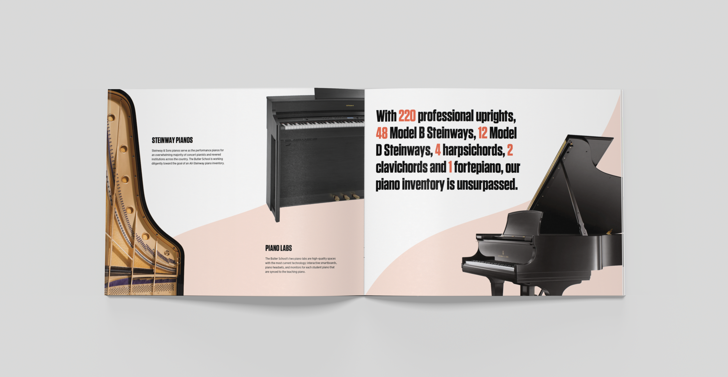
A visually bold and distinctive cover, bold typography and a soundwave representing a music staff on the cover was translated throughout the inside of the viewbook, resulting in an editorial piece that increased visibility on tabling, and increased student admission numbers.


Tinted “sounds waves” were used as an element that added dynamism to each spread, and also provided flexibility within the structure of the grid while allowing differentiation between each spread. The grid rises above the uniformity implied by its structure; allowing a dynamic visual experience for each spread that engages the reader through consistent order, and clarity of the visual presentation of the content.